
Most of us inherit Canvas courses. The pages arrive with odd titles, text made large and red to look like headings, links that say “click here” and images nobody described. Rebuilding everything is rarely realistic. You can improve Canvas pages one at a time, with a short checklist. This post is a companion to Bad Practice in Canvas and How to Fix It and Tips and Tricks for Better Canvas Wiki Page Design.
Learning outcomes
By the end of this post you’ll be able to
- Identify structural problems on an inherited Canvas page.
- Apply a checklist to headings, links, images and consistency.
- Evaluate where a design plug-in can help and where it cannot.
Why refresh instead of rebuild
Rebuilding a course from nothing throws away content that works, and it takes time you may not have. A refresh keeps the content and fixes the structure around it. It also suits term time, because you can do one page at a time.
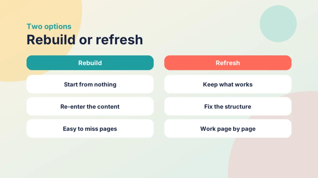
Start with the pages students see first and most often: your start-here page, the weekly overviews and anything linked from every module. Pages opened once a year can wait.
What good structure looks like
Four things do most of the work.
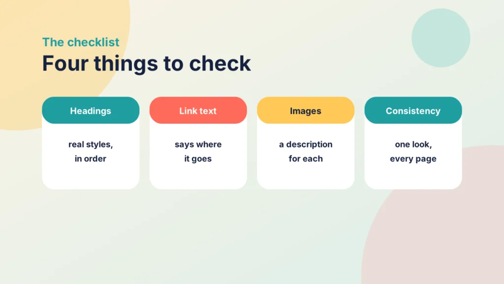
- Headings. Use the heading styles in the editor, in order, not bold text made big. Canvas shows the page title as the top-level heading, so start your own at Heading 2. Headings also let screen reader users move through the page.
- Link text. Say where the link goes, such as “Week 3 reading list (PDF, 2 pages)”. Out of context, “click here” tells a screen reader user nothing.
- Images. Describe what matters in the image, or mark it as decorative if it adds nothing.
- Consistency. Use one look for headings, lists and callouts across the course, so students learn where to find things.
For more on layout, see Tips and Tricks for Better Canvas Wiki Page Design. For the wider question of when to use a page and when to use a module, see Driving Canvas: Modules vs Pages.
A worked before-and-after page
Here is an invented but typical page.
Before:
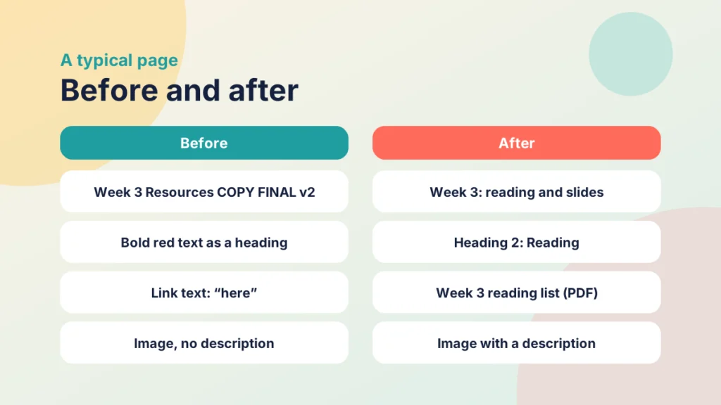
- Title: “Week 3 Resources COPY FINAL v2”.
- A heading made from large, bold, red text.
- Links reading “click here” twice.
- A diagram with no description.
After:
- Title: “Week 3: reading and slides”.
- A Heading 2 reading “Reading”.
- Links reading “Week 3 reading list (PDF, 2 pages)” and “Week 3 slides”.
- The diagram with a one-sentence description.
Put it into practice
Try it in Canvas
- Select Pages in Course Navigation, then View All Pages, and open one inherited page.
- Select Edit, then open the Accessibility Checker to see flagged headings, contrast and image problems.
- Use the Format menu to turn fake headings into Heading 2 or Heading 3.
- Select any vague link and rewrite its text so it says where it goes.
- In Settings for the course, select Validate Links in Content to find broken links.
Put it into practice
Your turn
Open one inherited page in your own course. Fix its title, its headings, its links and one image, then read it as a student would. Note how long it took.
Try it yourself
Spot the problems on this page
Tick everything on this inherited page that needs fixing, leave the rest, then check your answers.
Where a design plug-in fits
Cidi Labs describes its DesignPLUS Transformation Wizard as working inside the Rich Content Editor, without coding, to apply branding, design styles, accessible headings and icons to existing pages. I have not tested it, and this is vendor material, so treat it as a description and not a recommendation.
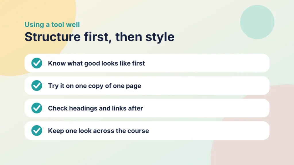
A tool like this can save time on consistency, because it applies one look at once. But it applies a look; it does not know what your content means. What a heading should say, what a link should be called and what an image shows still need you.
So do the checklist first, so that any tool starts from a sound structure, and check the result afterwards with the Accessibility Checker.
Check your understanding
Knowledge check
Why start your own headings at Heading 2 on a Canvas page?
Canvas shows the page title as the top-level heading, so your sections sit beneath it.
What makes link text useful?
It says where the link goes, such as the name and format of the document.
Remember
Key takeaways
- Refresh pages one at a time, starting with the ones students see most.
- Fix headings, link text, images and consistency.
- Use real heading styles, starting at Heading 2.
- A design tool applies a look, but you still decide what the content says.
Your next step
This week, choose one page that every student opens and run the checklist on it. Afterwards, ask a colleague to scan it with a screen reader or the Accessibility Checker, and see what is left to fix.
Reflect: which page in your course would a new student find hardest to read, and what would you change first?