
Students rarely tell you that your Canvas course is hard to navigate. They simply miss the reading, submit in the wrong place or email you to ask where something is. Every one of those moments costs attention that should have gone on learning.
Learning outcomes
By the end of this post you’ll be able to
- Evaluate your course menu and Home page for recognisability
- Apply one repeatable pattern to every module in a course
- Design the shortest sensible route from Home to each weekly task
Good navigation comes down to three qualities: recognisable, consistent and easy. They build on each other, so we will take them in that order.
Make the course recognisable
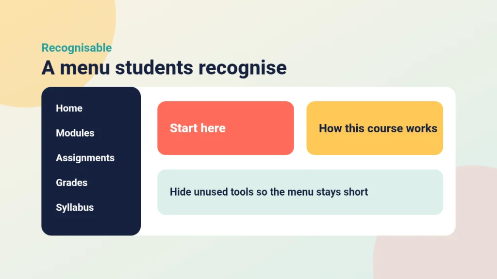
Students arrive with expectations from other courses. If your course looks and behaves like a place they have been before, they spend no effort working out how it works.
Begin with the course menu. Canvas shows many tools by default, and most courses use only a handful. Every unused item is a place a student might wander into and find nothing. Instructure’s guide to managing Course Navigation links shows how to hide what you do not use. A menu of five or six items is usually plenty.
Next, choose your Home page deliberately. For most courses, either the Modules page or a short “Start here” page works well. Changing the Course Home Page takes a minute. If you opt for a Start here page, keep it brief and point to where students go each week. My post on writing a How This Course Works page for week one covers what to put on it.
Finally, use the words students already use. If the programme handbook says “seminar”, do not call it a “synchronous session” in Canvas. For a fuller look at orientation, see Understanding the N in PANDA: Navigate.
Put it into practice
Your turn
Open one of your courses in Student View. Count the items in the course menu, then write down which ones you have actually used this term. Hide the rest.
Make it consistent across every module
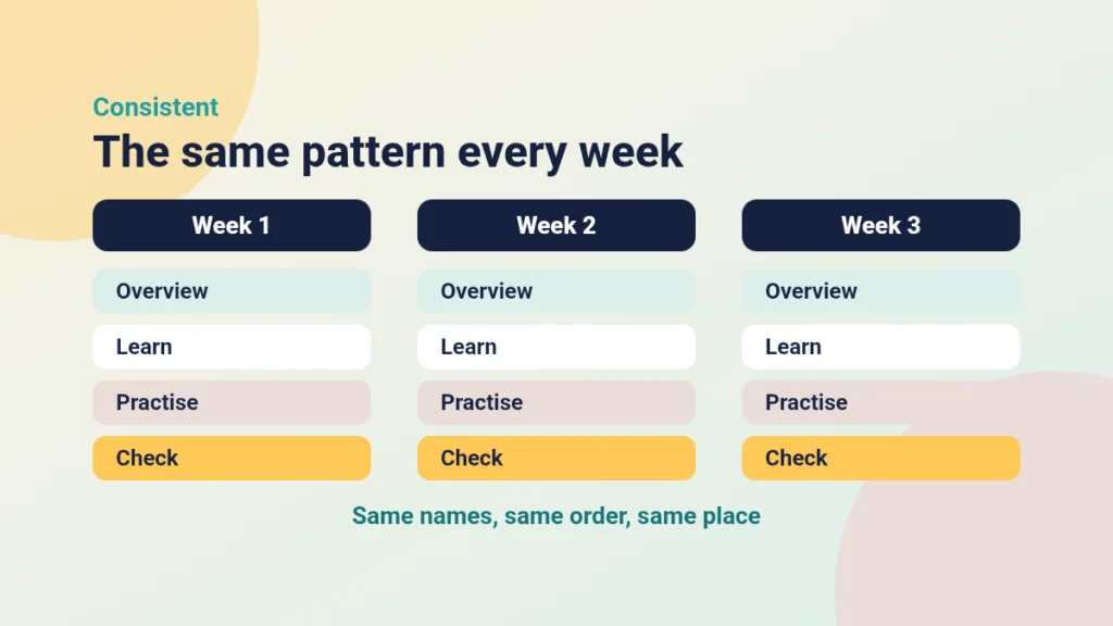
Once students have learned how Week 1 works, Week 2 should cost them nothing. Consistency lets them stop thinking about the interface and start thinking about the content.
Pick a pattern and keep it. A simple one might be Overview, Learn, Practise, Check. Use the same names, the same order and the same item types every week. If the Week 1 quiz sits at the bottom of the module, it sits at the bottom in Week 9 too.
Consistency also covers smaller things:
- Name items the same way, for example “Week 3: Seminar task”, not a mix of styles.
- Use one module per week, or per topic, but not both in the same course.
- Use the same page layout for similar pages. The Content Builder is useful here, and my notes on wiki page design help with the layout itself.
If you are unsure whether to build with modules or pages, Driving Canvas: Modules vs Pages sets out the trade-offs. Try the quick check below to see which habits help and which get in the way.
Helpful or confusing navigation?
Swipe each habit to say whether it helps or hurts students finding their way.
Make it easy to get to the task
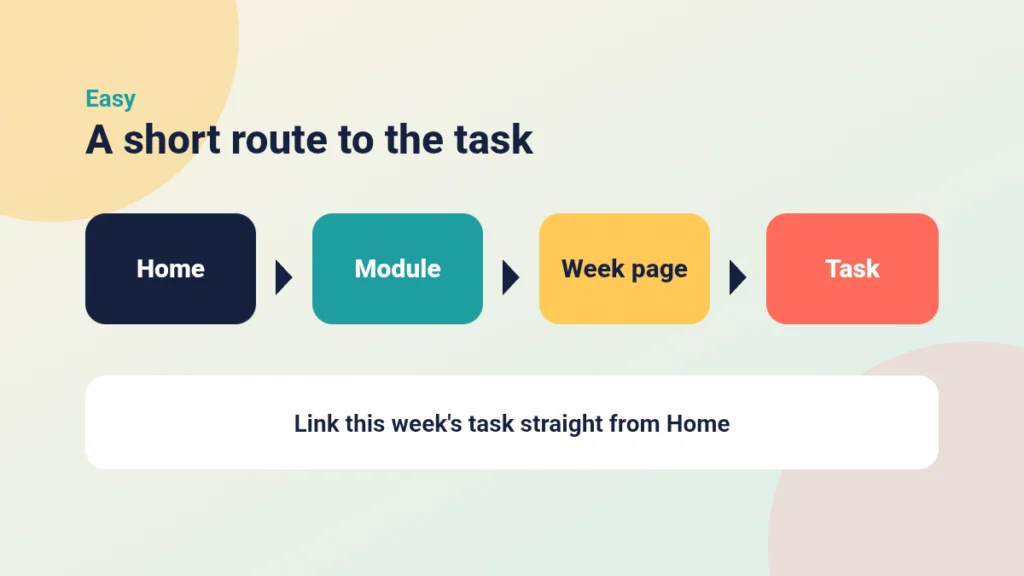
A course can be recognisable and consistent and still be tiring to move through. Ease is about the number of steps between a student and what they need to do.
Aim for a short, predictable route: Home, then module, then item. Avoid burying work inside several layers of sub-headers and nested pages. Where a task matters this week, link to it directly from the Home page or the module overview. Write links that describe the destination, such as “Submit your Week 3 reflection”, rather than “click here”.
Avoid offering three routes to the same thing. A file that lives in Files, on a page and in a module is a file you will one day update in only one place. Choose one route and keep it. For more of these habits, see Bad Practice in Canvas and How to Fix It.
Case study
Three routes to one reading list
Illustrative example
The context
A second-year module at a UK university had grown over several years, with content added by different tutors.
The challenge
Students kept asking where the weekly reading was. It appeared in Files, on a Resources page and inside some modules but not others. Module names followed three different styles.
What they did
The module leader hid unused menu items, set the Modules page as the Home page and rebuilt each week with the same four parts. The reading list moved into one “Learn” item per week, and the old Resources page was removed.
What happened
Questions about where things were dropped away in the following weeks, and tutors reported that updating a week became quicker because they only had one place to edit.
What would you do?
- Where does your own course offer more than one route to the same item?
- Which route would you keep, and why?
Put it into practice
Your turn
Choose one task students must complete next week. Starting from the Home page, count the clicks needed to reach it. If it is more than three, add a direct link or move it up the module.
Check your understanding
Knowledge check
Why should you hide unused items in the course menu?
Each unused item is a dead end students may visit, and a shorter menu is easier to recognise and scan.
What does a repeatable module pattern save students from doing?
Relearning the layout each week, so they can spend effort on the content instead.
A reading list lives in Files, on a page and in a module. What is the problem, and what would you do?
Updates will drift between copies and students will not know which is current. Keep one route and remove or redirect the others.
Rewrite the link text “click here” for a Week 3 reflection submission.
Something like “Submit your Week 3 reflection”, because link text should describe the destination.
Remember
Key takeaways
- Recognisable means a short menu, a deliberate Home page and familiar wording.
- Consistent means the same module pattern, names and order every week.
- Easy means few steps from Home to the task, with one route to each item.
- Student View is the quickest way to test all three.
Your next step
This week, pick one module and walk through it in Student View as if you were a new student. Hide any unused menu items, then check that each week follows the same pattern. Afterwards, note how many steps it takes to reach the next assessed task.
Reflect: If a student missed your induction session, could they still find their way around this course unaided?