Most Canvas courses are built from a handful of page types, repeated many times: a weekly overview, a reading list, an assessment brief, a how-to guide. Yet each one tends to be rebuilt from scratch in the Rich Content Editor (RCE), and each one comes out a little differently. The PrettyJaded Content Builder is designed to take that effort away. This post explains what it does, why repeatable page structures help students, and how to use it to build consistent pages across a whole course.
Learning outcomes
By the end of this post you’ll be able to
- Explain why a repeatable page structure reduces effort for both students and staff.
- Apply the Content Builder to create a Canvas page without formatting it by hand in the RCE.
- Design a small set of page patterns, with fixed and flexible parts, for a whole course.
- Evaluate a built page for accessibility and clarity before students see it.
Why Canvas pages need a repeatable structure
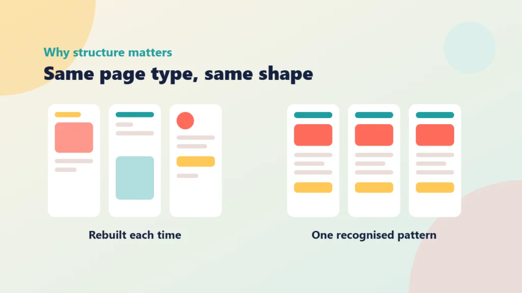
Think about the first fortnight of a module. Students are learning your subject, but they are also learning your course: where the tasks are, what a page is asking of them, which bits are optional. Every time a page looks different from the last one, they have to work that out again.
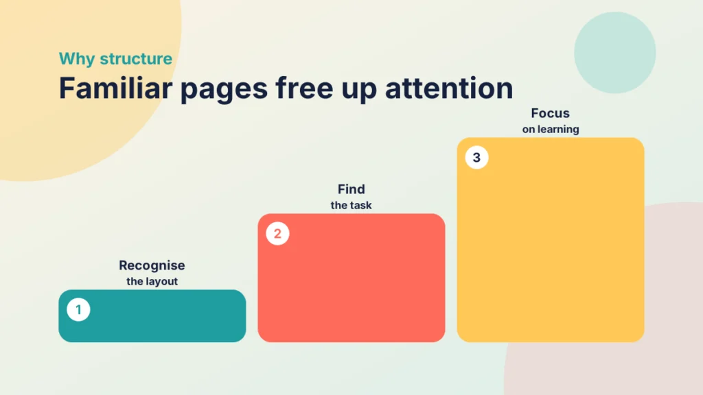
A recognised structure removes that work. When every weekly overview opens with the same purpose line, then the same outcomes, then the same ordered tasks, students stop hunting and start doing. The layout becomes background, and attention goes to the content. That is the point of consistent design: not uniformity for its own sake, but spare attention for learning.
There is a staff-side benefit too. Pages built to one pattern are quicker to write, quicker to review and far easier to update. If three colleagues share a module, a shared structure also means students do not feel they are moving between three different courses. I covered the visual side of this in Tips and Tricks for Better Canvas Wiki Page Design, and the course-level logic sits behind the PANDA framework.
The difficulty is practical. The RCE is flexible, which also means it is blank. Without help, consistency depends on remembering which heading level you used last week, copying an old page and deleting its content, or pasting in markup that you hope still works. That is where a builder helps.
Put it into practice
Your turn
Open your course and list the page types you build more than three times: for example weekly overview, reading list, activity instructions, assessment brief. Beside each, write the three things a student needs to find in the first ten seconds. You will use this list in the next two sections.
What the Content Builder does inside the RCE
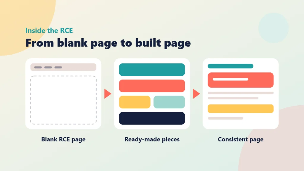
The RCE gives you a toolbar and an empty canvas. The Content Builder gives you structure to start from. Instead of formatting each heading, panel and list by hand, you assemble the page from ready-made pieces, then fill them with your own words. The Content Builder page has the current options and instructions, so I will not list every control here. What matters for course design is what the approach changes.
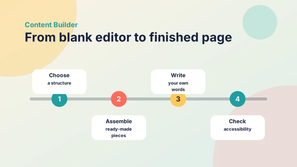
Less formatting, more writing
Most page-building time goes on small decisions: spacing, emphasis, how to make a tip stand out from the body text. A builder makes those decisions once, consistently, so you spend your time on the teaching content. For a lecturer building thirty pages before term, that adds up quickly.
The same look every time
Because pieces come from one source, a callout on week two looks like the callout on week nine. Students learn what each piece means, so a highlighted box becomes a signal rather than decoration. This is what makes a structure recognised rather than merely similar.
A cleaner starting point for accessibility
Consistent construction makes accessibility checks easier. Headings run in a predictable order, and you can fix a problem once and know where else to look. A builder does not replace checking, though. Whatever you build, run the checker before you publish. Instructure explains this in its guide to using the Accessibility Checker in the Rich Content Editor. For the wider picture, see WCAG 3 Is Still a Draft: What to Do in Your Canvas Course Now.
Put it into practice
Try it in Canvas
- In your course, select Pages in the course navigation, then + Page. Instructure’s guide to creating a new page in a course covers the basics.
- Give the page a title that follows a naming pattern, such as “Week 3: Overview”.
- Use the Content Builder, following the instructions on its page, to choose the structure that matches your page type and bring it into the RCE.
- Replace the placeholder text with your own content, keeping the headings in their original order.
- Select the Accessibility Checker in the RCE and fix anything it flags, then select Save.
- Use Student View to read the page as a student would, and check you can find the key details quickly.
If you want to check pages from the student side, Instructure’s guide to viewing a course as a test student shows how Student View works.
Try it yourself
Build a page in order
Put the steps for building a page with the Content Builder in a sensible order. Use the arrows to move a step.
Build a pattern once and use it across a whole course
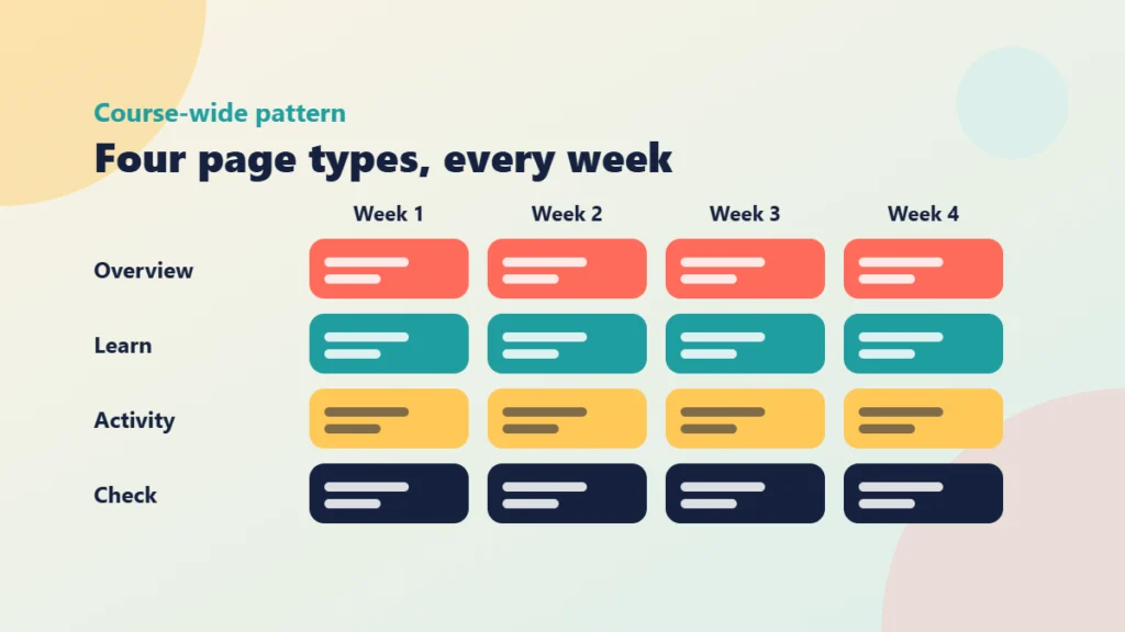
The real gain comes when you stop thinking about single pages and design a small set of patterns for the course. Each pattern is a page type with a fixed shape. Once you have built it well, every later page of that type is a matter of filling in content.
Decide what stays fixed and what flexes
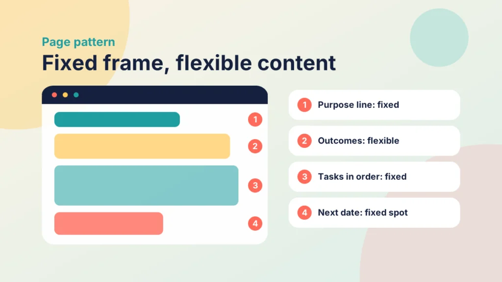
For each page type, separate the parts that never change from the parts that always do. The fixed parts are the order of the sections, the wording of recurring labels, and where things like time estimates and deadlines sit. The flexible parts are the content itself: outcomes, readings, tasks and examples.
This distinction protects you from over-standardising. A pattern is not a script. If a week needs a different activity, the activity changes while the frame stays the same.
Start from your structure, not your pages
If you have not yet chosen how a week is organised, do that first. One Page vs Pre-In-Post vs PANDA compares the main options. The page patterns then follow from the structure you pick. A PANDA week, for instance, needs a weekly overview that points to Prepare, Activate, Navigate, Demonstrate and Articulate in turn.
Keep the set small
Four to six patterns will cover most courses. More than that and you are back to students learning a new layout every week. Fewer than that and you may be forcing different jobs into one shape. If you are unsure, start with the page types you listed in the task above and add another only when an existing one clearly does not fit.
Maintenance gets easier
Courses change. A policy updates, a link breaks, a new reading list arrives. When pages share a structure, you know where to look and what to change. If you inherit older material, the before-and-after checklist for refreshing Canvas pages is a good companion for deciding which pages to rebuild to your pattern first.
Roll out a page pattern across a course
Put the steps for introducing a page pattern in a sensible order.
Examples of pages you can build
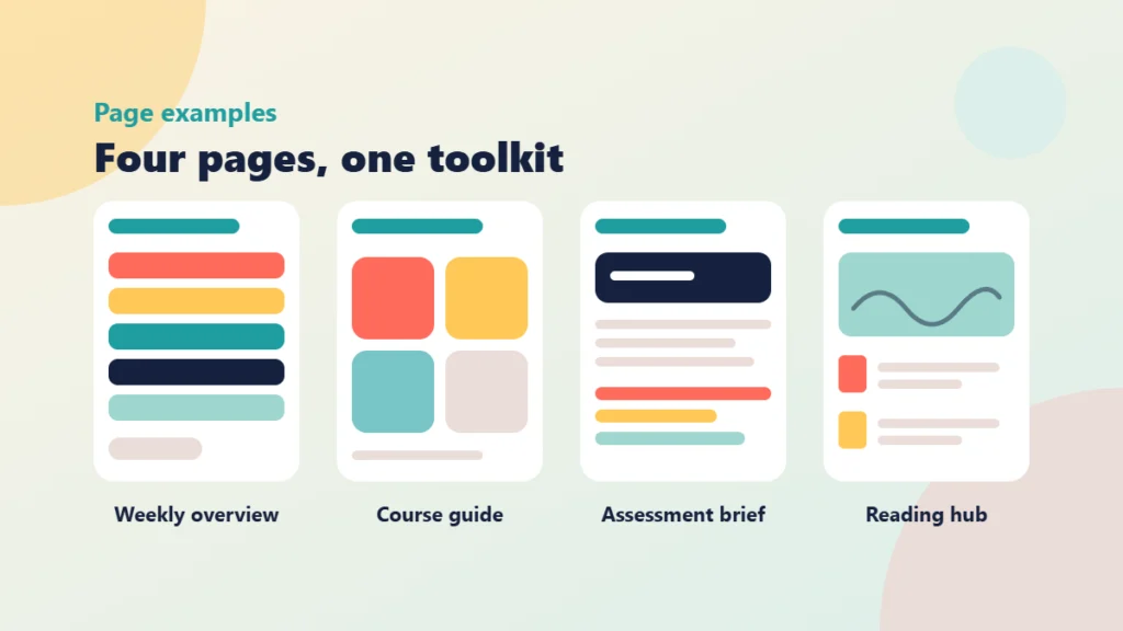
These four examples are structures to adapt, not fixed templates. Each shows the kind of page the Content Builder helps you assemble, with the order of parts that suits its job.
Try it yourself
Page structures at a glance
Choose a page type to see the order of parts that suits its job. Adapt them to your own course.
1. The weekly overview
This is the page students return to most. Open with a one-sentence purpose for the week, then a short list of what students will be able to do. Add an estimated study time, then an ordered list of tasks, grouped under the stages of your structure. If you use PANDA, that means one short block for each stage, so a student can see the whole week at a glance. Finish with the date of the next live session or deadline.
2. The course guide
Every course benefits from a page explaining how it works. Build it from four panels: where to find things, how to get help, how you will communicate, and what is assessed and when. Because it uses the same building pieces as the rest of the course, students meet familiar patterns on day one. My post on writing a How This Course Works page for week one goes through what to include.
3. The assessment brief
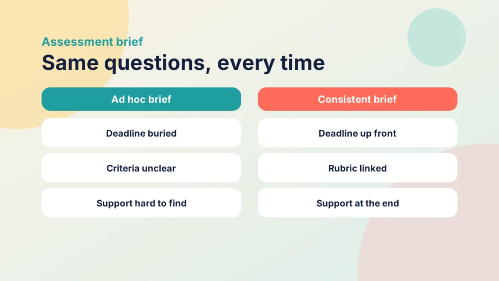
An assessment page should answer the same questions every time. State the task in one sentence, then the deadline and weighting, what to submit, a summary of the criteria with a link to the rubric, and where to get support. Add a clear statement on AI use. The post on an assessment-by-assessment AI statement in Canvas shows how to word it. With a consistent brief, students compare assessments easily and ask fewer clarifying questions.
4. The reading and media hub
A hub page works best when it separates essential from optional. Start with a purpose line, then list the essential items with an estimated time for each, then the extras. If you include video, put it near the top with a note on what to look for. Instructure explains how in its guide to embedding a video in a page. For when video earns its place, see How to Use Video Effectively at Every Stage of an Online Course.
Put it into practice
Your turn
Choose one of these four examples and build next week’s version of it with the Content Builder. Then ask a colleague, or a student if you can, to find three things on the page in thirty seconds, such as the deadline, the first task and where to get help. Note anything they struggle to find and adjust the pattern.
Fixed frame or flexible content
Sort each element of a weekly overview page into the part of the pattern it belongs to.
Try it yourself
Which page does the job?
Match what students are asking for to the page that answers it. Each page is used once.
Check your understanding
Knowledge check
Why does a recognised page structure help students, beyond making the course look tidy?
It removes the effort of working out each new layout, so attention goes to the content. Familiar patterns also let students find deadlines and tasks quickly.
A colleague wants every page in the module to be identical. What would you suggest instead?
Fix the frame (section order, labels, where times and dates sit) and let the content flex. A pattern should support different activities, not force them into one script.
You have built a page with the Content Builder. What should you do before publishing it, and why?
Run the Accessibility Checker in the RCE and read the page in Student View. A builder gives you a consistent start, but it does not replace checking the finished page.
Which parts of an assessment brief should stay fixed from one assessment to the next?
The order of questions it answers: the task, deadline and weighting, what to submit, criteria and support. Students can then compare briefs and find details quickly.
Remember
Key takeaways
- Students spend less effort navigating when page types look and behave the same way every time.
- The Content Builder shifts your effort from formatting in the RCE to writing the content.
- Design four to six page patterns for a course, with fixed frames and flexible content.
- Weekly overviews, course guides, assessment briefs and reading hubs are good first patterns.
- Always run the Accessibility Checker and view the page in Student View before publishing.
Your next step
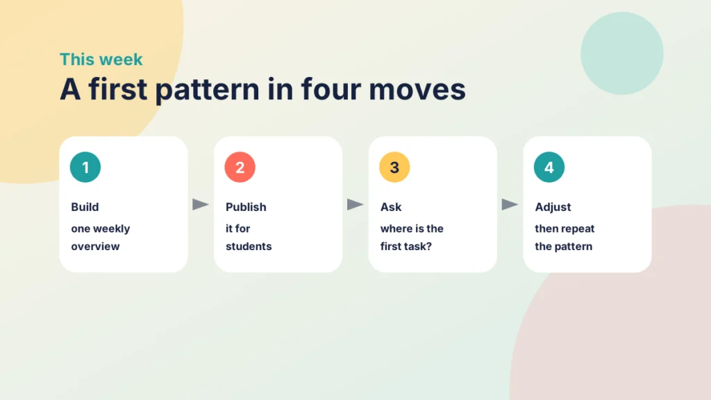
This week, pick one module and build a single weekly overview page with the Content Builder, using the structure from the examples above. Publish it, then ask two students, or a colleague standing in as one, to tell you where they would look for the first task and the deadline. If they find both without hesitation, repeat the pattern for the next week. If not, adjust the order of parts before you build any more.
Reflect: Which page in your course do students ask about most often, and what would a clear, repeatable structure for it look like?
Keep going
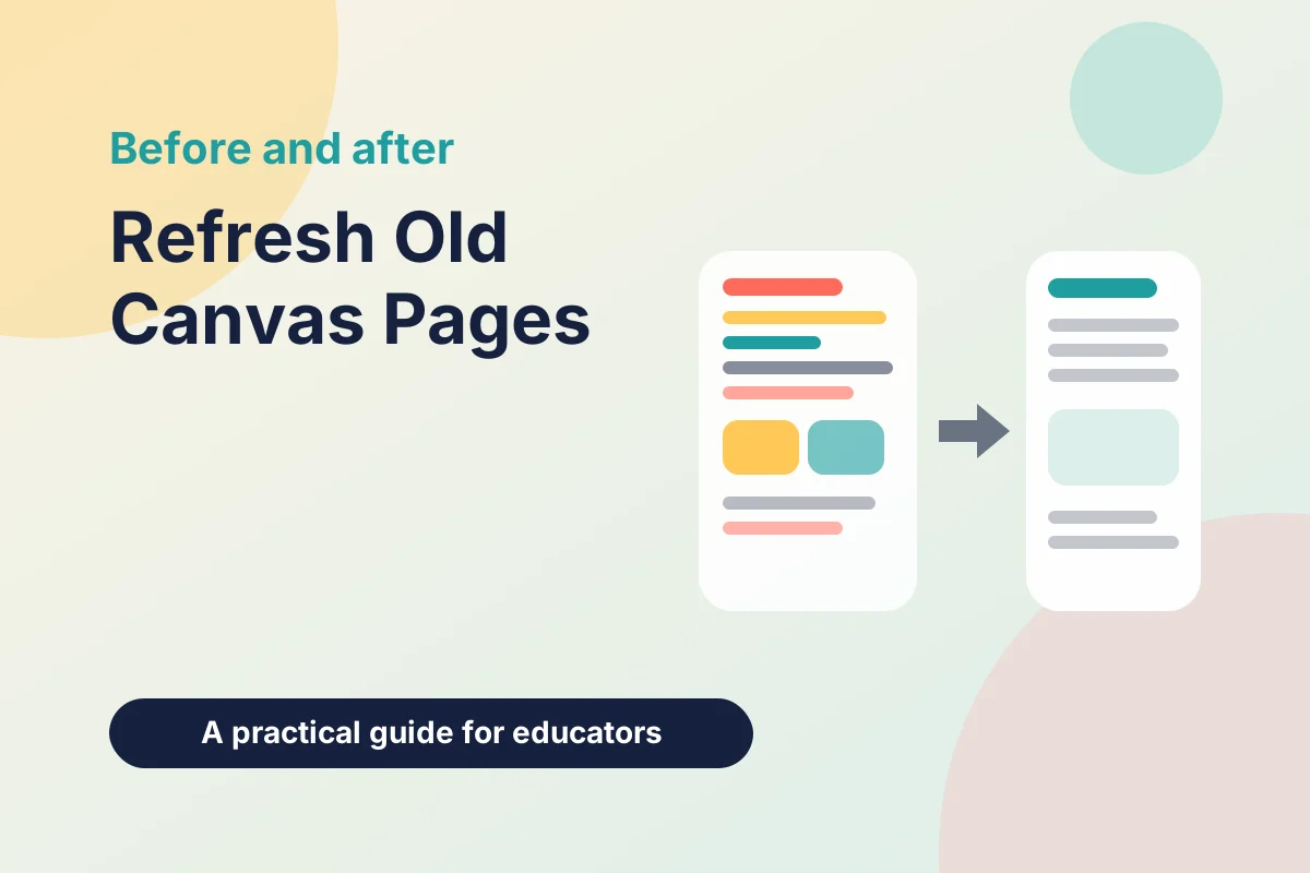
Refreshing Old Canvas Pages Without Rebuilding Them: A Before-and-After Checklist
You can improve inherited Canvas pages one at a time. This post gives you a short checklist for headings, link text, images and consistency, with a worked before-and-after page.
Plan for Student Note-Taking in Canvas Before Term Starts
Instructure has announced Notebook, built-in note-taking for learners in Canvas. Here is how to check it, shape your pages around it and keep notes out of your marking.
Using the PrettyJaded Quiz Builder With Canvas Quizzes and Item Banks
What the PrettyJaded quiz builder is for, where quizzes belong in good course design, and how to get reviewed questions into Canvas quizzes and item banks.