Accessibility is not a special feature for a few students. Many of the changes that help disabled students also help others, such as someone studying on a phone, in a noisy room or in a second language. This post gives you five tips you can apply to the pages you already have, and a way to check them in Canvas.
Learning outcomes
By the end of this post you’ll be able to
- Explain why accessible course design benefits all students.
- Apply five accessibility tips to a Canvas page.
- Use the Accessibility Checker to find and fix common problems.
Why accessibility belongs in every course
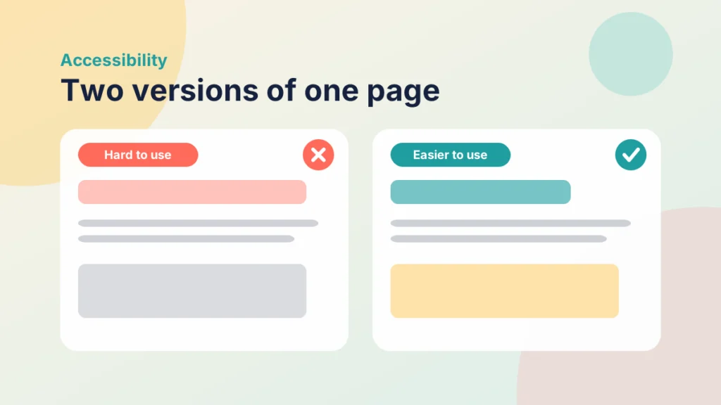
Students arrive with different needs, and many of them do not tell you. Some have declared disabilities, some have conditions that they have not disclosed, and some are in a situation that makes access harder for a while. If you design for access from the start, fewer students need to ask for an adjustment.
It is also a legal and institutional expectation. In the UK, public sector bodies, which include publicly funded universities and colleges, have duties under accessibility regulations to meet WCAG standards at level AA. Check which version your institution follows, and what your own team is asked to do.
A useful way to think about it is the idea of universal design for learning: offer more than one way to engage, to receive information and to show what you know. You do not have to master it all at once. Start with the content you have.
Plain language matters here too. Long, dense instructions are harder for everyone, and they are especially hard for students who are tired, anxious or reading in a second language. Short sentences and a clear order of steps reduce the effort it takes to understand what to do, which leaves more attention for learning.
Accessibility also fits the Prepare step of the Introduction to the PANDA Framework, because it is much easier to build in from the beginning than to fix later. If you are working on older material, Refreshing Old Canvas Pages Without Rebuilding Them offers a way to improve pages bit by bit.
Five tips to start with
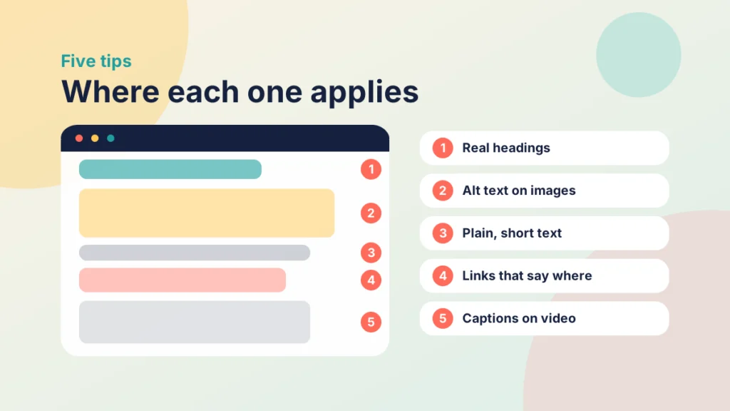
1. Use real headings
Headings give a page structure. Screen reader users can jump from one heading to the next, and everyone else can scan. Use the heading styles in the editor, in order, and avoid making text bold and larger to look like a heading.
2. Write meaningful alt text
Alt text describes what an image shows and why it is there. For a chart, say what the chart tells you. For a decorative image, leave the description empty so that screen readers skip it. Keep it short.
3. Do not rely on colour alone
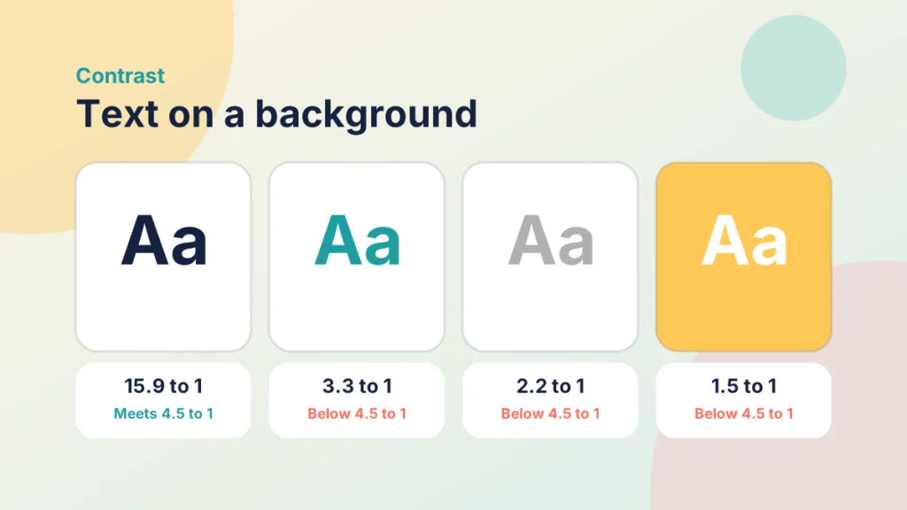
If red means late and green means on time, add a word or a symbol too. Check that text has enough contrast against its background. Pale grey on white looks tidy but is hard to read for many people.
4. Caption video and describe audio
Captions help deaf students, and also students in a noisy room, or those working in a second language. Provide a transcript for audio. Check automatic captions for mistakes, especially in subject terms. How to Use Video Effectively at Every Stage of an Online Course covers planning video that works for everyone.
5. Use plain language and clear links
Short sentences, clear instructions and familiar words help every reader. Write link text that says where the link goes, such as “Read the assessment brief”, instead of “click here”. Screen reader users often listen to a list of links out of context.
A note on files: a scanned PDF is often just a picture of text, so a screen reader cannot read it. Where you can, share the content as a page, or as a document with real text and headings. If you must use a scan, check that the text can be selected, or use text recognition to make it searchable. Check the original too, because a poor scan is hard for everyone to read.
Put it into practice
Your turn
Open one Canvas page you use often. Check its headings, the alt text on each image and the wording of each link. Fix the three weakest points.
Case study
A module page that works for more people
Illustrative example
The context
A lecturer has a module page with a long block of text, a chart without a description and a link that says “click here”.
The challenge
Several students said the page was hard to follow, and one student using a screen reader found it difficult to navigate.
What they did
The lecturer added headings, wrote alt text for the chart, rewrote the link text and added a transcript to the video. The changes took under an hour.
What happened
Students found the page easier to scan, and the student using a screen reader could move through it by heading.
What would you do?
- Which fix would you make first on one of your own pages?
- How would you check that the change worked?
Put it into practice
Your turn
Pick one document or video you share with students. Check that it has real text or captions, and that a student could follow it without seeing the screen.
Try it yourself
Match the problem to the fix
Choose the best fix for each problem.
Check your course in Canvas
Before you begin, try something simple: move through a page using only the Tab key and see where you end up. If you cannot reach a link or the order feels strange, a keyboard user will have the same problem. You can also turn on a screen reader that comes with your computer and listen to a page for a minute.
The Rich Content Editor in Canvas includes an Accessibility Checker. It will not find every problem, but it catches many common ones, and it is a quick habit to build.
Put it into practice
Try it in Canvas
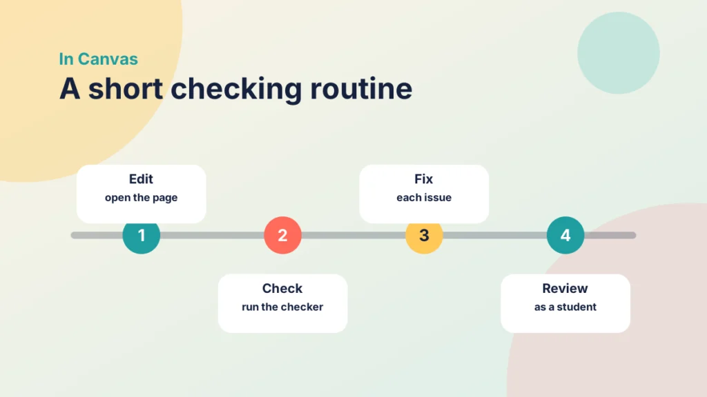
- Open a page or assignment and select Edit.
- In the Rich Content Editor, find the Accessibility Checker in the editor toolbar or status bar.
- Select it, and work through each issue it lists, such as missing alt text or low contrast.
- Add alt text by selecting an image, then Image Options.
- Use the Format menu to set headings, then select Save.
- Check the page in Student View, and try it with the keyboard alone.
If your institution provides an accessibility tool, such as a content checker, use it as well. It may cover files and documents that the editor does not. Bad Practice in Canvas and How to Fix It also lists common problems that overlap with accessibility.
Try it yourself
Check the contrast
Choose a text colour and a background colour, and see the contrast ratio. Try at least four pairs.
Make accessibility a habit
You do not need to fix an entire course in a day. A few habits make progress steady.
- Check as you build. Run the checker before you publish, not after.
- Fix the busiest pages first. Start with the pages students use most.
- Keep a short checklist. Headings, alt text, contrast, captions, links.
- Ask students. A short question at the end of a unit about what made content hard to use gives you useful information.
Work with others too. Your institution may have an accessibility or digital learning team who can advise on difficult cases, and your disability support team can often tell you what barriers students report most. Sharing a short checklist with colleagues spreads the habit and saves each person from learning the same lessons alone.
Remember that a tool cannot judge everything. It will not tell you whether alt text is useful, or whether your instructions make sense. Your own reading and a student’s view are still the best checks.
Check your understanding
Knowledge check
Why should alt text be short and meaningful?
Screen reader users hear it read aloud, so it should say what the image shows and why it matters.
Why use real heading styles rather than bold text?
Assistive technology can use headings to move around a page, and bold text only looks like a heading.
What should you do when colour carries meaning?
Add a word or symbol too, and check contrast.
Where can you check a Canvas page for common issues?
In the Accessibility Checker in the Rich Content Editor.
Remember
Key takeaways
- Accessibility helps all students, not only those with declared needs.
- Use real headings, meaningful alt text and links that say where they go.
- Do not rely on colour alone, and check contrast.
- Caption video and provide transcripts for audio.
- Use the Accessibility Checker as a start, and add your own judgement.
Your next step
This week, choose one page that students use often and run the Accessibility Checker on it. Fix every issue it finds, then re-read the page as a student would. Afterwards, note which problem came up most often so you can avoid it next time.
Reflect: which page in your course would be hardest to use for someone who cannot see the screen, and what would you change first?